
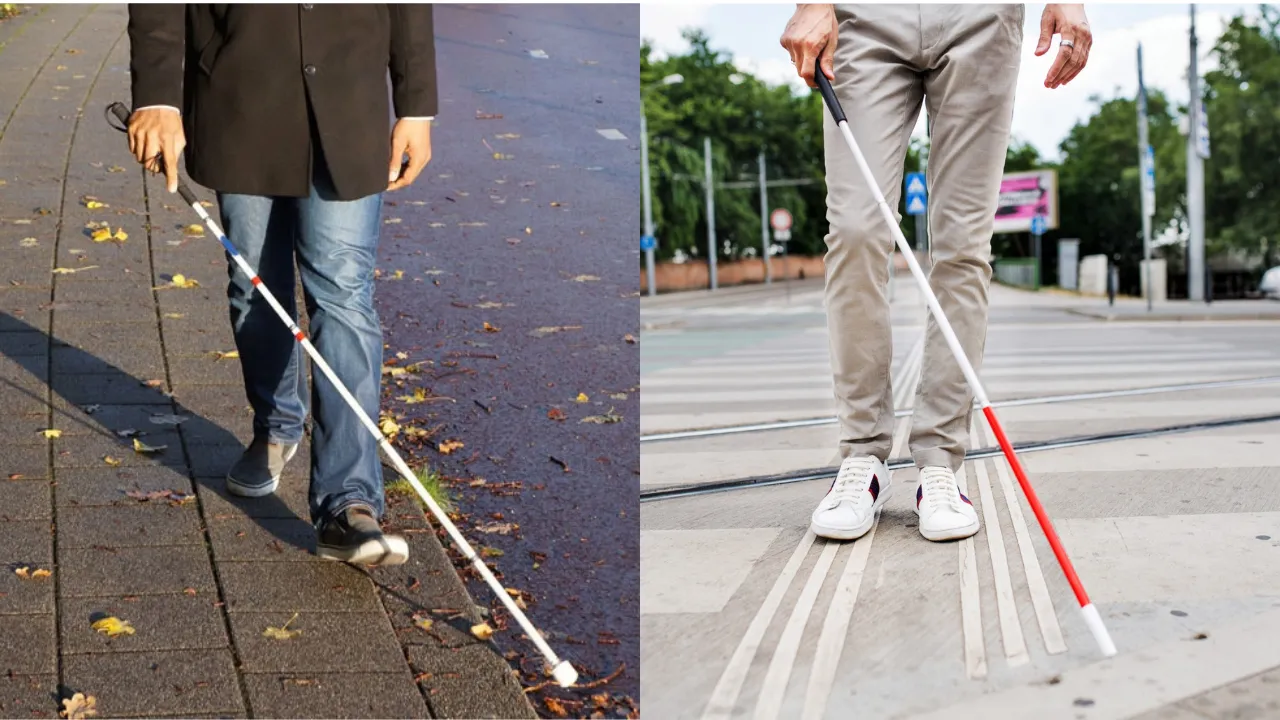
When we think of a blind or visually impaired person, one of the first things that may come to mind is a white cane. We have probably seen people using one while walking along the street or crossing the road, but many of us may not realise that blind canes come in different colours.
Each colour carries a specific meaning, helping others understand the user's level of visual impairment and how they can offer assistance when needed.
Let's take a look at the different colours of blind canes and what they mean.
1. White
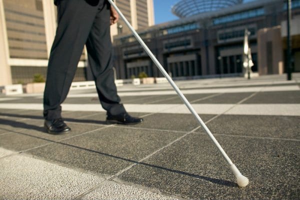 Image Credit: Braille Works
A white cane generally indicates that the user is blind or has severe visual impairment. Its bright colour makes it easier for sighted people to spot the user and be aware of their presence, especially in public spaces.
2. White with a red bottom
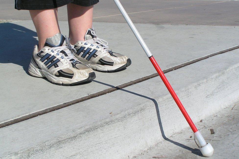 Image Credit: BBC
People who use a white cane with a red bottom often have some remaining vision. The cane can indicate that the user is partially sighted and may have a greater degree of vision compared to someone who uses a fully white cane.
The red section at the bottom can also be easier for users to see, helping them identify curbs, steps, and other uneven surfaces while navigating their surroundings.
3. Red and white striped
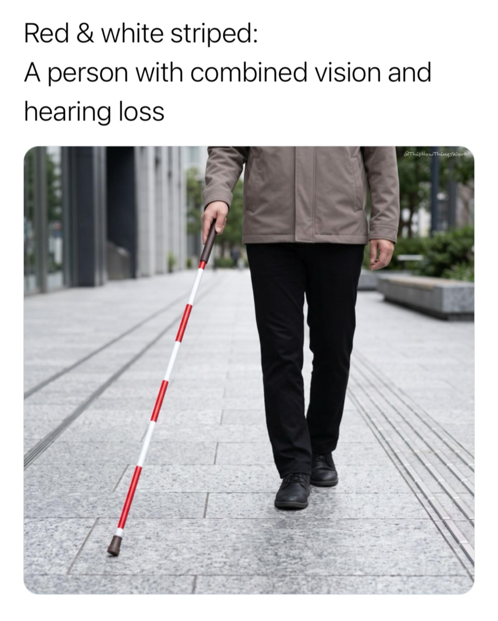 Image Credit: Instagram
Individuals who use a red-and-white striped cane are typically both visually impaired and deaf or hard of hearing. As a result, they may require different forms of communication and assistance due to their dual sensory impairments.
4. Green
The green cane, also known as a green mobility cane, is generally used by people with low vision rather than total blindness. This colour was first introduced in Argentina in 1994 and is now used in some countries, including Argentina and parts of Europe.
Why is tactile paving important?
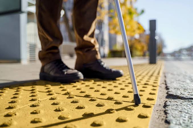 Image Credit: Freepik
In addition to using blind canes, many people with visual impairments rely on tactile paving to navigate public spaces safely.
These are the bumpy yellow, and sometimes black, tiles commonly found at public transport stations, shopping malls, and along sidewalks.
The raised circular bumps serve as warning indicators, alerting users to hazards or changes in the path ahead, such as the end of a walkway or the approach of a road crossing. Meanwhile, the raised parallel lines act as directional indicators, guiding users along a safe route.
While tactile paving may appear to be little more than a textured pattern to sighted individuals, it serves as a crucial navigation tool for people with visual impairments. Blocking these pathways, whether intentionally or unintentionally, can make it far more difficult for them to move around independently and safely.
Featured Image Credit: lhblind, OE Patients
You may be interested in

1pcs random Sonny Angel HIPPERS - Harvest Series Mini Figure Blind box Cute Hippers decoration Line up?12 types
![[REJURAN] Turnover Mask 5 Sheets | Hydration, Skin Renewal, Soothing, Glow](https://d3lmgsai2rsy7d.cloudfront.net/astro-products/2026/07/08/6a4dc59c3f4c75.50851671-sg-11134207-824h6-mpsyplv65cenbd)
[REJURAN] Turnover Mask 5 Sheets | Hydration, Skin Renewal, Soothing, Glow

GJ Jewellery Emas Korea Emas Bangkok 24K Woman Anklet Daun/Jubin Sliver Gold/Gila-gila Love (26cm-27cm) GA-8
![[NEW] Tracey Easy Off-Trail Card Holder With Lanyard Dompet Kad Wanita](https://d3lmgsai2rsy7d.cloudfront.net/astro-products/2026/07/08/6a4dc59cb6ba80.79699010-sg-11134201-82588-mfrz4om8r9cdd0)
[NEW] Tracey Easy Off-Trail Card Holder With Lanyard Dompet Kad Wanita