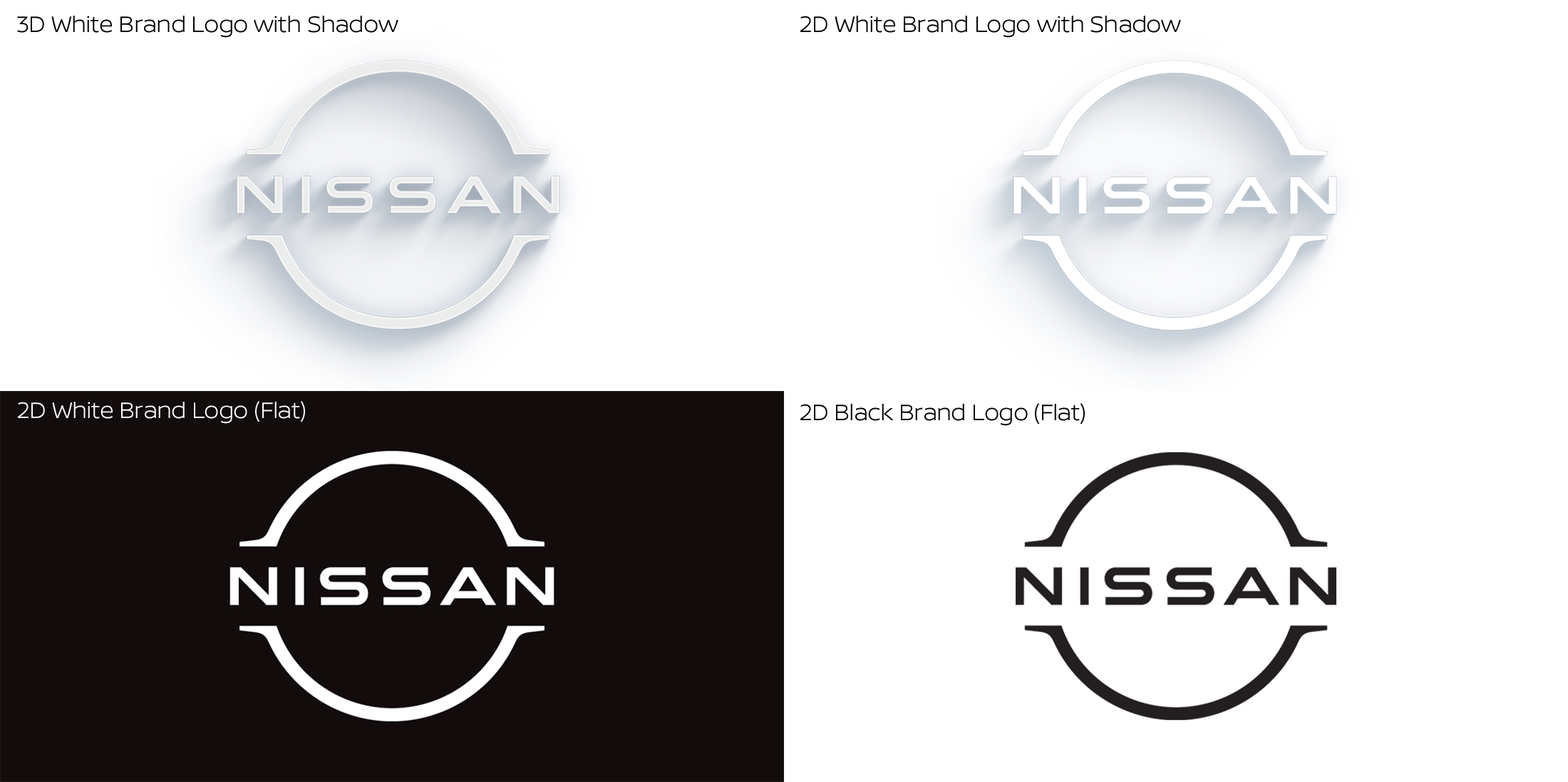
It may not seem like it, but the current Nissan logo has been around for two decades. Now that the logo is as old as the PlayStation 2, Nissan has decided that it is time to get on with the times and let the bygones be ‘by-Ghosn’.

Mind you, the logo is not a complete redesign. The ‘NISSAN’ brand name still rests on the equator and is sandwiched between two hemispheres. The brief calls for a logo that will exist on all upcoming all-electric models need to look crisp when lit and still look impressive on-screen as well as on paper. The keywords ‘thin, light and flexible’ was also uttered by Alfonso Albaisa, Nissan’s Senior Vice President of Global Design, in 2017, when the study to change the logo started.
More importantly, the new logo must embody founder Yoshisuke Aikawa’s belief, “Shisei tenjitsu o tsuranuku.” The founder interprets the phrase to mean, “If you have a strong belief, it penetrates even the sun.”

We should start seeing Nissan’s new logo on the soon-to-launch Almera. Eventually, the emblem will appear on all of the Japanese carmaker’s upcoming cars, showrooms and all forms of digital and physical communications.
Nissan isn’t unique in evolving the logo to the times. Volkswagen, BMW and Proton have already done it, and we expect the other carmakers to follow suit if they want to look good in the digital era.


