
Over the next few months, you’ll be seeing changes in Volkswagen’s dealerships and communication-mediums as the company swaps out the old logo for the new. This change has happened, and still is happening all over the world to standardise the company’s global image. And unlike BMW’s effort, Volkswagen’s new logo will appear on their upcoming MQB- and MEB-based vehicles.
Volkswagen’s new emblem does away with any sorts of embellishments like 3D bezels, embossed letters and chrome glazing that would otherwise make the logo look gaudy, bloated and difficult to adapt. Although that design may have looked solid during the early naughties, change is needed if they want to leave behind a decade of scandals, controversies and bad juju.
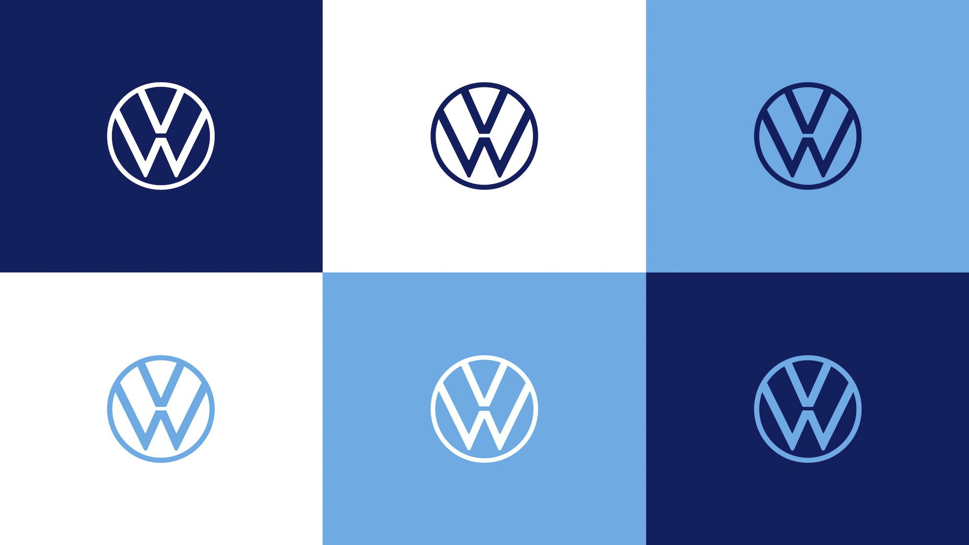
The new logo is designed to be slim with typography that clearly defines where the ‘V’ ends, and the ‘W’ begins. The contrast of colours between the ‘VW’ and the background puts the logo front and centre. Its simplicity makes it easy to adapt the logo to various mediums, especially those in the digital realm. Volkswagen said that the emblem will be legible even when displayed on a smartwatch.
And to complete the makeover, you won’t be hearing ‘Das Auto’ in their advertising nor the disembodied male voice that says it. In its place, you’ll only be listening to a female voice speaking the company’s name. Nice.
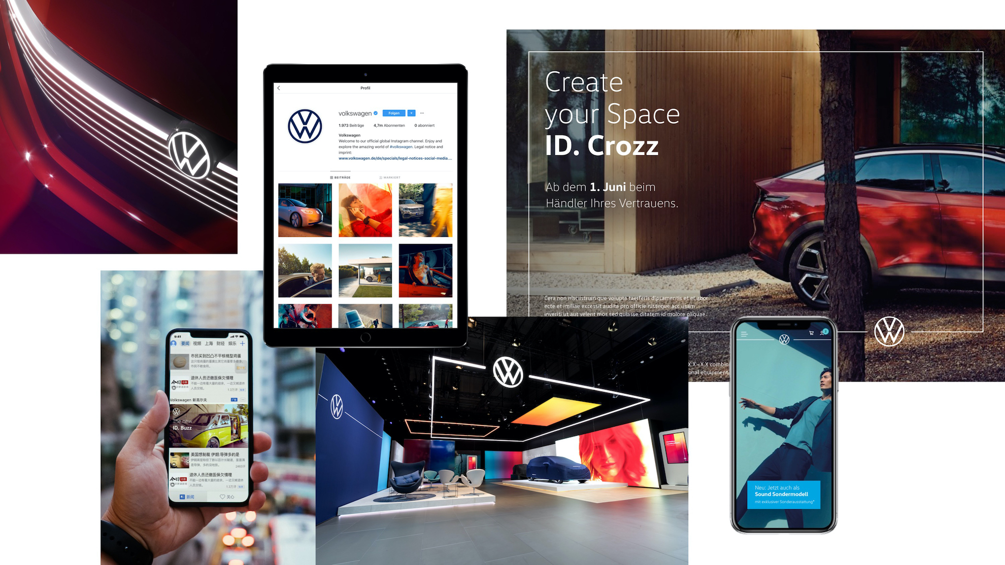
Volkswagen might be one of the first to trim the fat off the logo for the digital age, and they definitely won’t be the last. Media consumption on digital platforms won’t stop rising, and if car companies want to make a big impact, they first need to adapt to smaller screens.
Now, watch Volkswagen Malaysia’s video introduction of their new logo: