
As a deeply-entrenched Apple fanboy, it's difficult for me to uproot my life for an Android phone. The "regular" offerings from Samsung or the many, many, Android phone makers didn't pique my interest as they kind of blurred together after awhile.
Looking at the ecosystem from the outside, Android seemed like the wild west of devices with competitors' embellished claims of camera performance, screen fidelity, and countless gimmicks.
In the midst of all this noise, Nothing came out with the Phone (1) that had a visually striking design, an intriguing UI, and yes, a glyphy gimmick that caught my attention.
While the glyphs are the obvious entry point to the phone, I'd say the actual value of the NP (2) is more than just fancy lights, it's in the brand that they're trying to cultivate and the values that the company stands for with its phone.
That said, starting at RM2,999 for the 12GB RAM + 256 GB storage option, is the Nothing Phone (2) actually any good? And, six months in, what's new with the phone?
The screen, at this price, is actually great
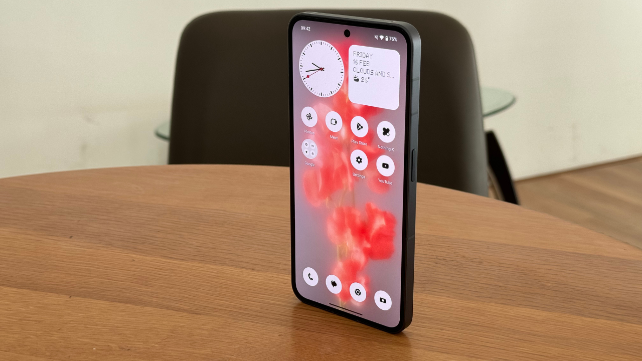
With a refresh rate of 1 – 120Hz, the NP (2)'s screen is dynamic in use and sips on the battery. The always-on display is intelligent too and knows how to turn completely off when face down or in a dark room at night.
The screen is bright enough even under direct light and it's crispy enough to enjoy content and play games on. It's just a nice screen to interact with.
Now most Android flagships have vibrant screens too, but most come off as too saturated and unnatural. The NP (2), like the iPhone, manages to present natural colours with pleasing sharpness. It's neither as high res as the iPhone 15 Pro Max nor as bright, but it gets the job done for a lot cheaper.
You don't feel like you're being discounted here and that's going to be a running theme of this review. At RM2,999 the NP (2) goes toe to toe with flagships in the parts that really matter to regular people.
Nothing OS, is also, great
I remember reviewing the Samsung S5 back in the day and unlocking the phone with the water droplet sounds. Even back then as a greenhorn tech reviewer, I thought this was such an awkward feature for a phone and really... cringe as the young people say.
I also remember trying on the HTC One with its premium build and understated Android OS and thinking that more phone makers should stop skinning Android.
The Google Pixel is the most tolerable Android interface because it strips any whimsy that phone makers try to shoe horn into their phones to differentiate themselves but even then, it's too vanilla.
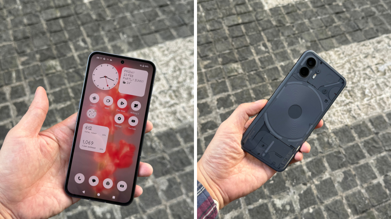
With the Nothing OS, there's cohesion in the design of the phone from the outside to the inside with its monochromatic design language.
Yes, it's hard to tell the weather with a bunch of dots and yes, I could not figure out what the app icons were supposed to represent, but they're going for something unified here instead of a product that's designed by seemingly two minds.
When you use the OS, you know that a designer intentionally worked hand in hand with engineers to ensure there's cohesion in the product and it shows.
I feel if someone has a shot of converting users, either from iOS to Android, or one Android phone to another, it’s a brand that’s sticking to its guns and differentiating themselves meaningfully to create their own tribe.
On the Google front, I didn’t realise how much of my life was controlled by Google until I swiped left from the home screen and was served articles and videos that were nearly 80% suited to my tastes.
My life on Chrome continues here on the phone, but besides the News app, I didn’t really benefit from having an Android phone as a Google account holder. I have quick access to Google’s workspaces but I also had that when I was using the iPhone.
Nothing OS stands out as something that has been optimised for the device it has been designed for. Though it uses an older generation chip, you hardly notice the difference. This brings the cost down and helps you feel confident that your phone will last a long time.
50MP camera is alright
There’s no over-sharpening here, over saturation, or over anything, really. It’s a functional camera that you can edit to your heart’s content with.
The iPhone still shoots visibly sharper photos with more even tones in the light and dark. The camera on the NP (2) is also noticeably slower than the iPhone when shooting at 50MP.
This is all fine since, while it is Nothing’s flagship, it is not a direct competitor to the iPhone nor the Samsung S series.
What you should take away from the Phone (2)’s camera is that it takes neutral photos and darkly-lit photos moderately well.
Since an image is only as good as the photographer who composes, captures, and edits it, you won’t go wrong using this camera.
Pro tip: if you’re using Nothing OS 2.5, change the double tap gesture shortcut to camera to reliably turn on the camera quickly. I’ve tried putting it as the lock screen shortcut, but you need to press down on the icon for a bit before the camera will launch.
Using Android as an iPhone user
The biggest benefit of using Android compared to iOS is how open it is. Need to transfer a file? Just plug the phone into your computer.
Need to download things from Google Drive (or anything site, really) simply tap download and look for it in the Files app that has… all the files you need.
On iOS, the photos are in a separate app while Files are kept in a separate app. The Files app on iPhone is also very cumbersome and organising it never felt easy nor intuitive.
That said, Android's greatest strength is also its greatest weakness as you can never really trust the files you’re downloading off the internet.
You don’t ever feel like you can freely browse and download files with an Android device which hampers the overall experience.
The fact that Apple and Android don’t play nice also affects the experience of Mac users since you can’t plug in an Android phone and transfer files freely.
There’s no way to secure Android without stripping its openness so, just like using Windows, you have to be slightly more vigilant when using an Android device.
Besides this big difference, there's not much that distinguishes the experience of using the Android from iOS. The scrolling is a little too fast, the keyboard looks poorly designed, ditto the Play Store, and Google keeps trying to advertise their products while you use their products.
Finally, the back, home, and switch app buttons are something that I actually prefer over gestures. It's more user-friendly for beginners, but is not as elegant looking as gestures.
The Secret Sauce to Nothing
Its community outreach through nothing.community/ and its YouTube page reinforces that feeling of being in a club. At the time of writing there was even a post about a community photo walk in London in anticipation of the launch of the Nothing Phone (2a). It's nice to have a community.
Community updates highlights creators from the community and concerns are directly address there which is rare for any phone company.
While Steve Jobs has famously been quoted as saying customers don’t know what they want, Nothing’s approach to hyperfocusing on the customer and the community around it, flies in the face of that philosophy and, I think, works to its benefit.
The inclusivity is novel (for now) and I think can only be done by a smaller team like Nothing. Personal tech is a form of expression whether you like it or not and your tech allegiance tell you a lot about yourself.
By actively addressing and engaging with its community, Nothing invites their customers in and converts them to Nothing tribe members.
While it’s design-focused, the glyphs usability is suspect at best and the Nothing skin is easy to replicate. Nothing’s success or failure as a company will be determined by how well they serve each member of their tribe and hopefully they will go to bat for them with each new product release.
Buy the Phone (2) now at their website or head to https://my.nothing.tech/ to wait for the launch of the new 2a.